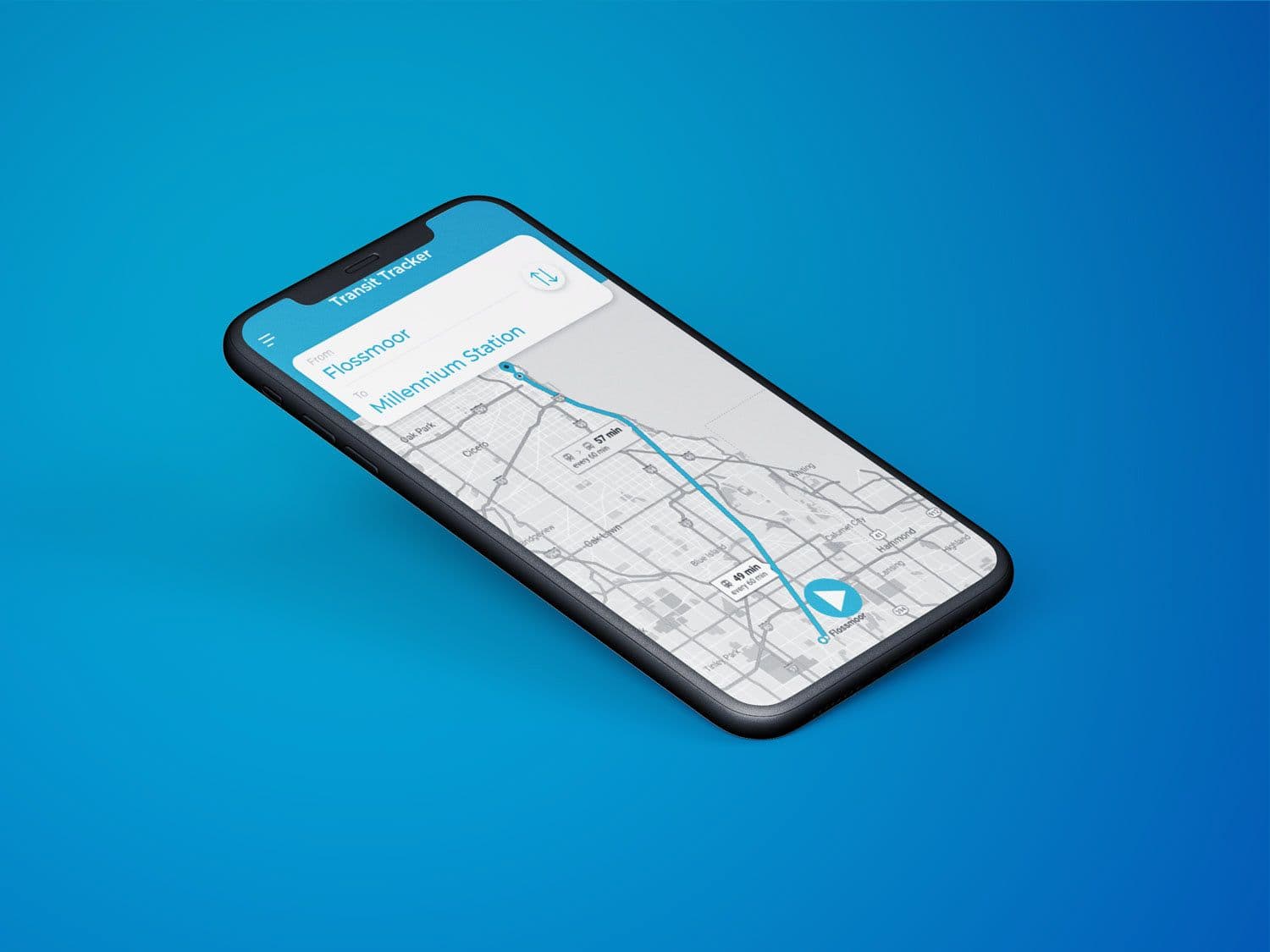
Introduction
Commuting from the suburbs to downtown Chicago by car can be such a pain so most Suburbanites take the commuter train, the Metra. In the past few years, Metra has phased out the physical ticket machines at the train stations. In order to purchase tickets, you either have to buy tickets on the train or use the Ventra app. However, there is an upcharge when you buy tickets on the train so really the only option is to use the app.
I've used the Ventra app many times to take the Metra into the city and, to be honest, it was one of the most frustrating app I've ever used. As someone who used to use this app almost daily, I thought it could be a fun project to see what changes could be made to improve the overall user experience.
Research
Before getting into any design work, I want to see if my experiences with the app were comparable to other people who used it. I interviewed a handful of fellow Metra riders to get an understanding on what they thought of the app.
Job Stories
I created job stories based on the interviews I had with other Metra commuters as well as my own understanding and experiences using the app to explore and understand people’s motivations for using the app and their desired outcomes.
When I ride Metra, I want an easy and visual way to track trains so I can easily identify which trains I should get on.
When I want to purchase a ticket, I want to be able to easily buy what I need so that buying tickets is a smooth, effortless process.
When I need to activate my ticket while on the train, I want to be able to quickly find and activate my purchased tickets so that I can show my ticket to the train conductor.
Defining Problem
I used my findings from my reserach to narrow down the pain points that I wanted to solve with my redesign.
Pain Point #1: There isn't a convenient way to track your usual train.
Most people take the same train route everyday. One of the most important things people want to know is when their next train is scheduled. That information should be pretty easy to find. But, with the current app, there are multiple steps involved just to find out that information. The first thing you see when you open the app is the navigation menu, which I think is odd. In order to track your train, you have to navigate to Train Tracker then, you either have to save your usual route by favoriting it or search for your route each time you want to check the schedule. I feel like that process should be smoother and easier to navigate to.
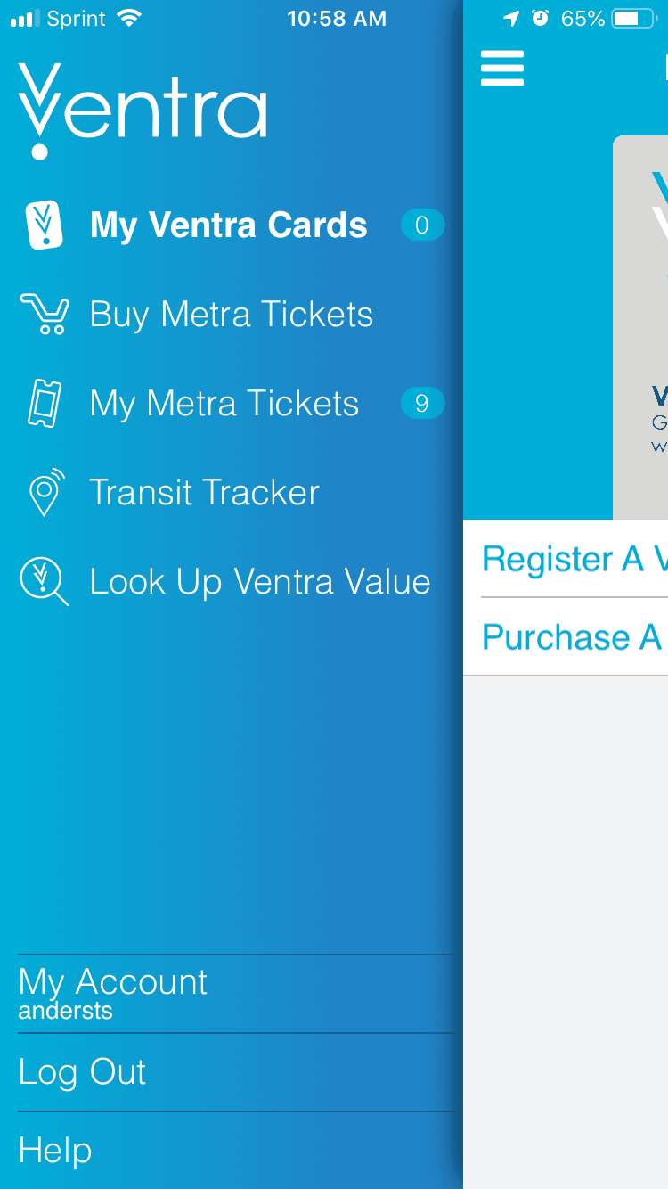
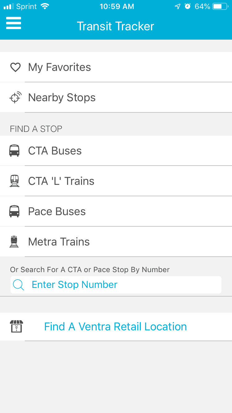
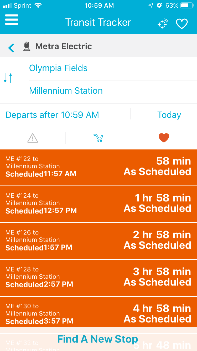
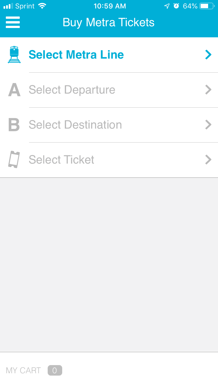
Pain Point #2: When purchasing tickets, you need to input the Metra Line, your departure and destination every time.
Once again, most people who use the app are daily commuters so it’s pretty annoying to have to input the same information each time you want to buy a ticket for a train line that you take every day. Also, this doesn't make it easy for anyone who doesn’t know Metra since you have to know which Line you need to be on before you can enter your departure.
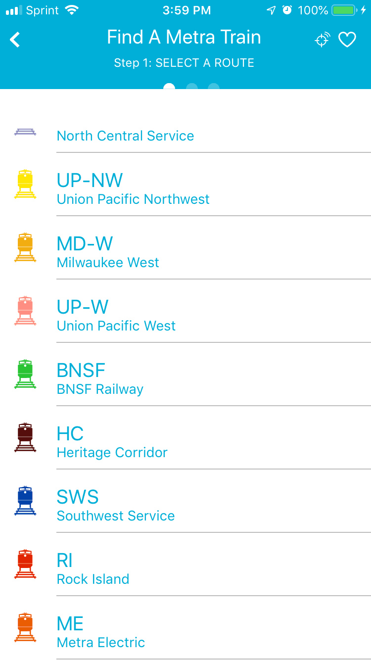
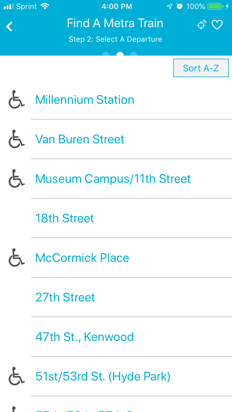
Pain Point #3: There isn't a visual way to view where each Metra Line goes or what stops are on that line.
If you’re unfamiliar with the Metra lines and stops, the app doesn’t provide a way to visualize where you are going. You just have to know or look it up elsewhere.

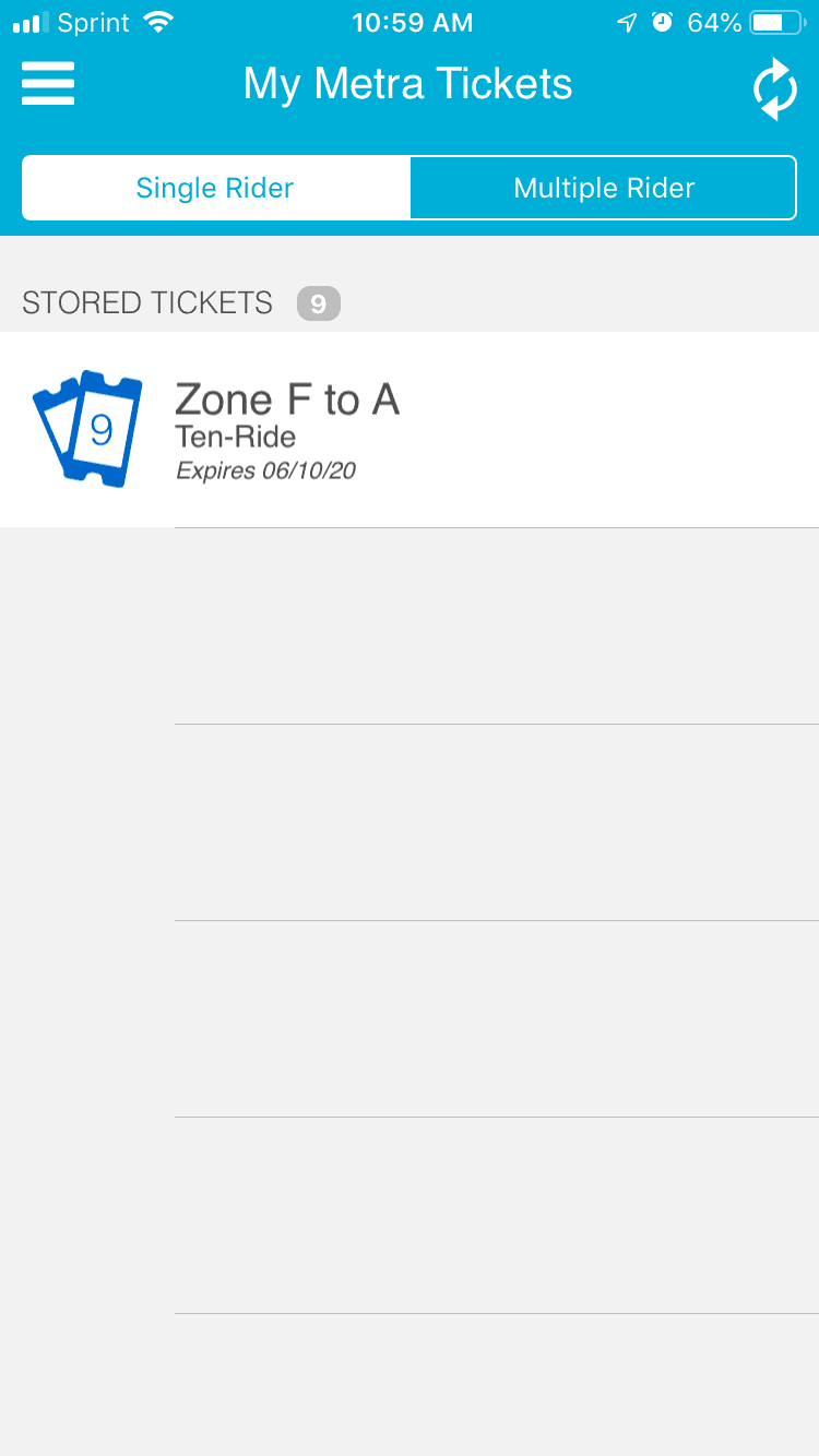
Pain Point #4: Purchasing and viewing tickets are in two different places.
Seems like it would make more sense for anything that involves ticketing to be in the same place, instead of navigating to different screens.
User Flow
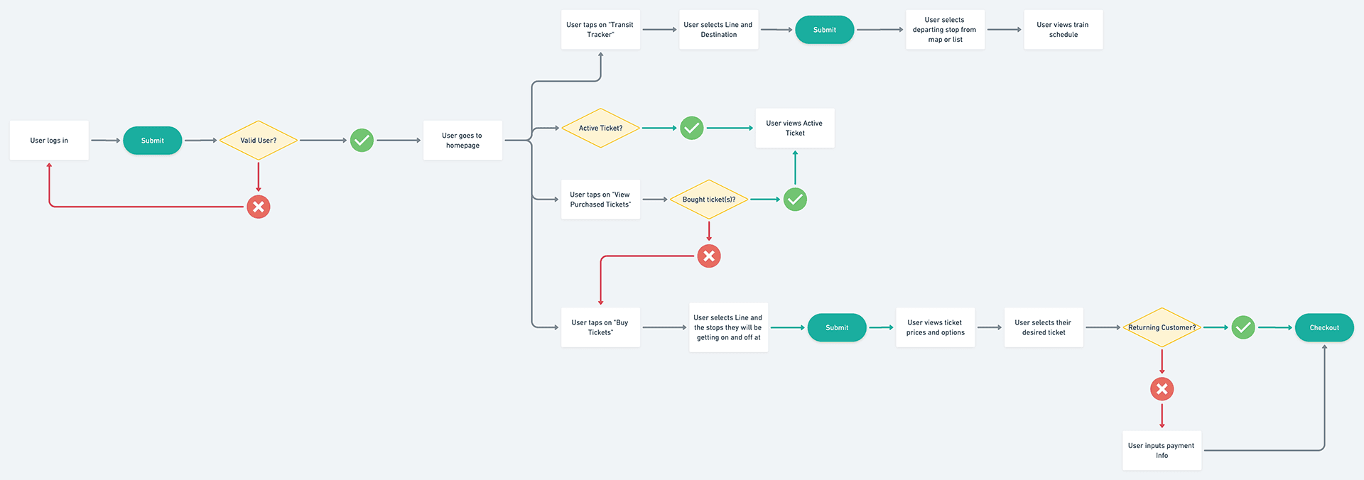
I created a user flow to show the flow for a user who wants to track trains and purchase tickets.
Ideate
UI Sketches
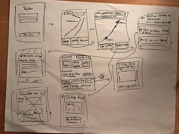
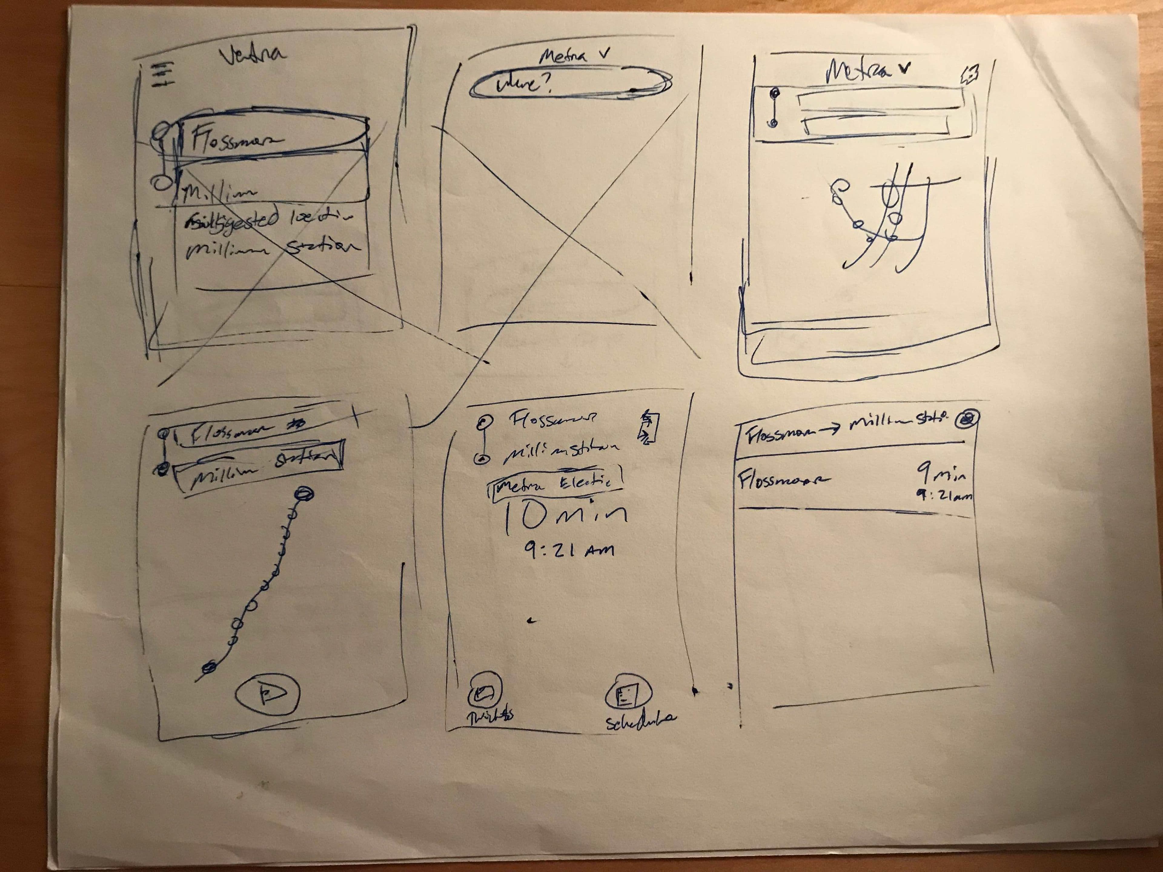
I came up with a few solutions for each pain point and created some sketches for the main features/screens that were in need of updating. These included the login, trip tracker, ticket management and train schedule screens.
Wireframes
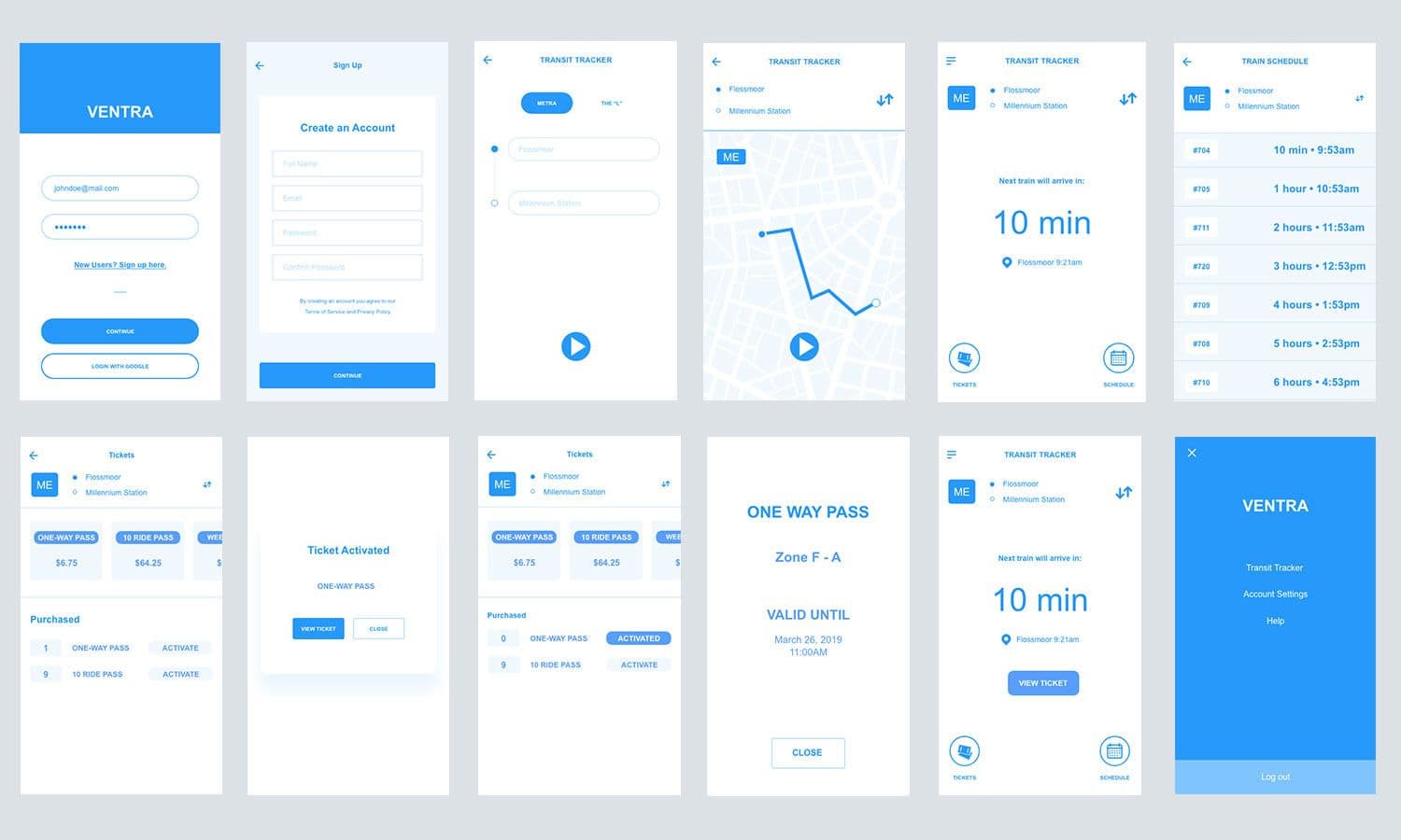
Once I had an idea of how the new designs would look like, I went to creating my wireframes.
Visual Design & Prototype
After creating the wireframes, I moved on to further fleshing out the design and creating a prototype to test if the changes I had made addressed the pain points discovered in my research. Here were my solutions:
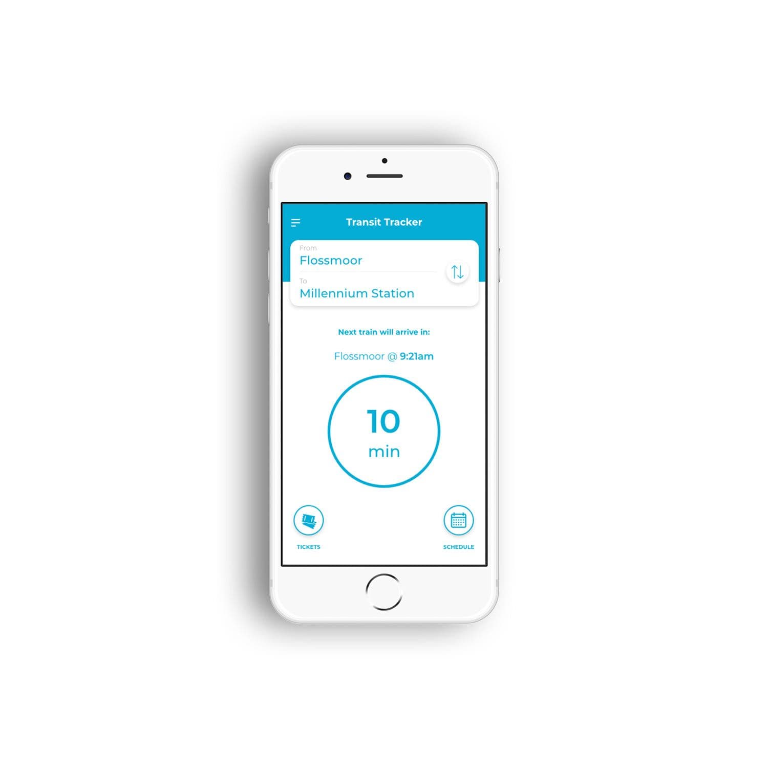
Pain Point #1: There isn't a convenient way to track your usual train.
Design Solution: Create a new dashboard screen that displays the next train for the user’s most recent train trip. When you open the app, you immediately see when the next train on your route is scheduled.
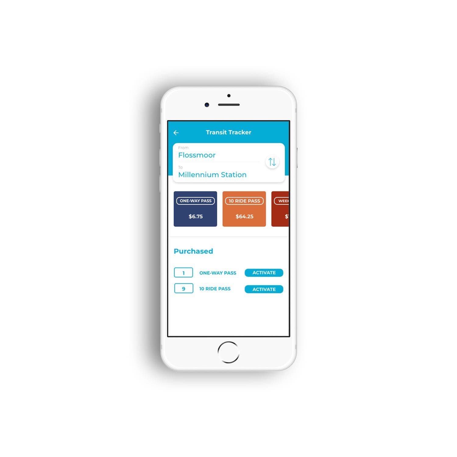
Pain Point #2: When purchasing tickets, you need to input the Metra Line, your departure and destination every time.
Design Solution: Automatically select the user’s most recent trip when they are purchasing tickets.
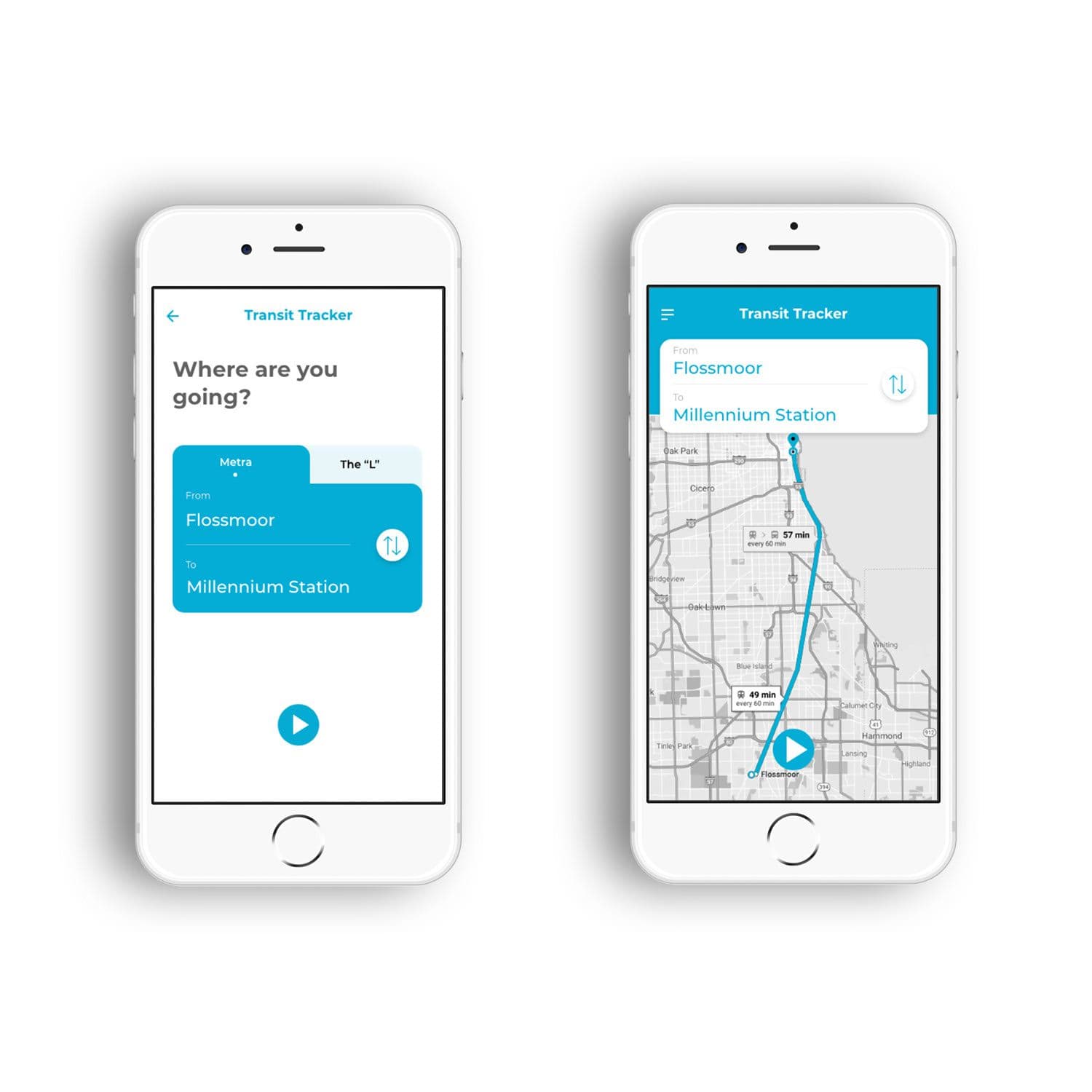
Pain Point #3: There isn't a visual way to view where each Metra Line goes or what stops are on that line.
Design Solution: Add a map when searching for a train route.
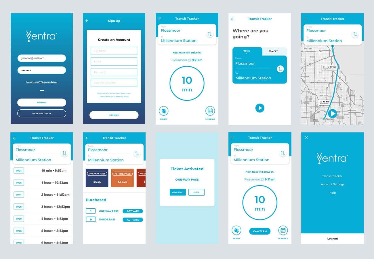
Pain Point #4: Purchasing and viewing tickets are in two different places.
Design Solution: Create a Tickets screen that allows the user to purchase and view tickets on the same screen. Also, add a button on the dashboard screen that allows the user to easily access their activated tickets while boarding the train.

Note: I do not work for, nor am I affiliated with, Ventra/Metra. I did this personal UX case study just as a designer who likes to solve problems. Ventra has released a redesigned app since the time of me writing this so this case study is based on the old version of the app.